Warm and Cool Colors: What's the Difference and How to Use Them in Your Space
Choosing colors to decorate our home is not just a matter of aesthetics. It has a direct impact on our mood and the atmosphere created in the space. One of the key elements worth knowing is the difference between warm and cool colors. By understanding their basic difference, we can design a home that expresses us and makes us feel comfortable in every room.
What Are Warm Colors?
Warm colors include shades like red, orange, yellow, and all shades in between. These colors are reminiscent of the sun, fire, and warmth. They bring energy and vibrancy to a space and create a more welcoming and homely feel.
When we use warm colors, we can make a large space seem smaller and “warmer.” They are ideal for living rooms , dining rooms , or any place where we want to enhance the social mood and warmth.
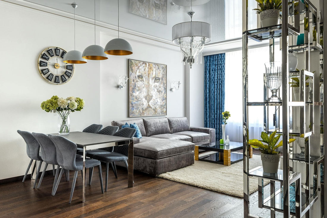
What Are Cool Colors?
In contrast, cool colors include blue, green, azure, and purple tones. These shades are inspired by nature (the sky, the sea, and the trees) and convey calm, serenity, and freshness.
Cool colors "open up" a space and can make it appear larger and brighter. They are ideal for bedrooms , bathrooms or offices . That is, places where relaxation and concentration play a leading role.
How to Choose Between Warm and Cool Colors?
The choice depends on both the function of the space and the feeling we want it to exude. Do we want a dynamic environment that enhances communication? Warm colors are the right solution. Do we prefer a calm, relaxing space? Then cool colors are the ideal choice.
Additionally, it's a good idea to consider the lighting in the room. A bright space with natural light can "lift" more intense hues, while a dark space may benefit from softer, cooler colors that create a sense of purity.
Balance and Combinations
In practice, most homes are not based solely on warm or cool colors, but on a balanced combination of the two. For example, we can choose neutral tones for the basic background and add vibrancy with colorful decorations or fabrics .
A simple way to find balance is the “60-30-10 rule”: 60% primary color, 30% secondary, and 10% accent. This combination works great for adding personality to a space without making it too overwhelming.
Conclusion
Understanding the difference between warm and cool colors can help us create spaces that meet our needs and enhance our daily mood. With a little care in choosing shades, we can create a home that is not only beautiful, but also functional and balanced.